
Every Woman Needs
She CAN Manage: Perfectly pleasing palette

One of the simplest, most cost-effective improvements a homeowner can make to their home is to paint. Whether you choose to paint the exterior of your house or give your rooms an update, that will translate into value for your home. It’s also one of the easiest things not-so-handy homeowners can do themselves without having to call in the pros. Aside from the paint itself — and maybe a weekend of your time — the investment is minimal: A set of paint rollers and brushes for the walls and trim, drop cloths to keep your floors and furniture paint-free and painter’s tape to protect ceilings, baseboards and so on, and you’re ready to go. If the thought of spending a solitary weekend painting is not your idea of fun, how about inviting some friends over for a paint party!
Preparing the surface prior to painting can make or break your paint job. It is rarely the paint itself that fails but rather the adhesion of the paint to the surface below. The reason paint fails to adhere is because the surface to which it was applied was dirty, wet or was loose itself, so make sure your paint surface is clean, dry, free from grease, oils and flaking or loose paint. This will give your primer and paint a good surface on which to bond. Use painter’s tape to tape the trim, window, and doorframes but remove the tape immediately after painting, before the wall dries, so you don’t peel off any paint with it. You should have a steady hand and attention to detail while ‘cutting in’; using a brush to paint around trim and the corners of the walls where your roller cannot reach. Do not underestimate the importance of cutting in well; a poor, jagged or wavy cutting-in job will jump out at you every time you walk by it! Once the walls are cut in, roll out the paint using good quality rollers.
Colour has the power to affect moods and productivity, so painting a room with the right colour does have an impact. When selecting paint colours, keep in mind that neutrals appeal to the greatest number of people, therefore making your home more desirable for sales. If you are not seeking to sell your home, have fun selecting colours that compliment your style and personality.
Step into any paint store and you will know the sky is the limit when it comes to colour selection! Selecting the right paint colour to complement your furniture and accessories can be daunting, however, a good rule of thumb is to remember the colour wheel. We all lea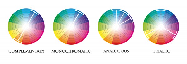 rned about the primary colours in school – red, yellow and blue. Combining any two of these will give you a secondary colour (i.e. purple, orange). Colours near each other on the colour wheel such as blue and purple are analogous to each other and will allow one colour to stand out more. Colours opposite each other on the colour wheel such as yellow and purple are complementary to one another and will give you a vibrant look. Staying within the same shade of colour (i.e. greens) is monochromatic and will give you a subtle and soothing look. Using a triadic colour scheme (three colours equally spaced apart on the colour wheel) can create a bold look. Painting with cool colours such as blues, greens and purples makes small rooms appear larger and airy while colours such as reds, yellows and oranges will give a room a more vibrant appearance. You can vary the warmth even with a red or yellow by choosing muted shades of those colours such as pink, peach or a buttery yellow. Neutral schemes include colours that are not included in the colour wheel, such as whites, browns, and blacks. Neutral colours offer elegance and flexibility in a room.
While deciding on the colours for your home, it is also important to assess the intensity of colours. For example, different shades of blue include, sky blue, royal blue, cyan, baby blue etc. Out of these shades, baby blue and sky blue are of low intensity. In the same way, every colour has a range of shades from high to low intensity. High intensity colours are better suited as accent walls in your main living areas whereas low intensity colours would be better suited in the bedrooms.
Exterior paint selection also requires some thought and, as shown in the photo, colour selection can enhance the architectural features of a home.  Bermuda vernacular style homes look stunning in white, brick red, terra cotta, a variety of pastels or even cement wash. All pair well with dark green or white trim. Small cottages can handle the intensity of bright pops of colour; turquoise, bubble gum pink and sunny yellow are great colour choices. A large sprawling home benefits from a more muted palette.
Take full advantage of the hundreds of paint selections and brochures at our local paint stores. Talk to the sales staff for advice on various colour schemes to achieve the look you want. There are also pre-selected colour palettes available at paint stores to assist in choosing the perfectly pleasing palette for you.
Sharika Tucci is the managing director, lead property manager and broker at Masterkey Management Ltd. She offers her clients over a decade of real estate and property management experience spanning various property types including commercial, residential, condominium, arable, recreational and social use properties.
Follow Masterkey Management on Facebook @masterkeymgt, Twitter @SharikaTucci or www.masterkey.bm.


SheHUB Nigeria: Shamsiya, the Nigerian woman padding young girls with love

International Women’s Month and How Herbode’s CEO Is Educating Girls And Building A Safe Haven For Survivors Of GBV

